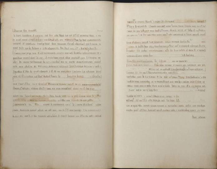
Typography plays a crucial role in enhancing the readability, aesthetics, and overall user experience of any written content. When it comes to designing documents, websites, or any other form of textual information, every aspect of typography must be carefully considered. One aspect that often gets overlooked but is essential for creating visually pleasing and readable text is the margin-paragraph gap.
What is the Margin-Paragraph Gap?
The margin-paragraph gap refers to the space between the text of a paragraph and the margins of a block of text. It is also known as paragraph spacing, paragraph padding, or paragraph margin. This space helps to visually separate paragraphs and improve the overall alignment and readability of the text.
Importance of the Margin-Paragraph Gap
Properly setting the margin-paragraph gap is crucial for several reasons:
-
Readability: Adequate space between paragraphs makes it easier for readers to distinguish one paragraph from another, reducing visual clutter and enhancing readability.
-
Visual Hierarchy: By adjusting the margin-paragraph gap, you can create a visual hierarchy within your text, guiding the reader’s eye through the content.
-
Aesthetics: A well-balanced margin-paragraph gap can significantly improve the overall visual appeal of your text, making it look more professional and visually engaging.
Factors to Consider when Setting the Margin-Paragraph Gap
Several factors influence how you should set the margin-paragraph gap in your typography:
-
Font Size and Line Spacing: The size of your font and the spacing between lines (leading) will affect how much space you need between paragraphs to maintain readability.
-
Line Length: The width of your text block also plays a role in determining the optimal margin-paragraph gap. Longer lines of text may require more space between paragraphs to prevent visual confusion.
-
Design Style: The overall design style you are aiming for will impact how you set the margin-paragraph gap. Clean, minimalist designs might call for smaller paragraph gaps, while more traditional designs could benefit from larger gaps.
How to Set the Margin-Paragraph Gap
Setting the margin-paragraph gap involves tweaking the top and bottom margins of your paragraphs. Here are some tips on how to do it effectively:
-
Consistency: Maintain consistent spacing between paragraphs throughout your document or website to create a cohesive look and improve readability.
-
Use Stylesheets: If you are working on a digital platform, such as a website or a document using software like Microsoft Word or Adobe InDesign, use stylesheets to set the paragraph spacing consistently.
-
Experiment: Don’t be afraid to experiment with different margin-paragraph gap sizes to find what works best for your specific content and design.
Best Practices for Margin-Paragraph Gaps
To ensure your margin-paragraph gap is optimized for readability and aesthetics, follow these best practices:
-
Avoid Excessive Gaps: Too much space between paragraphs can disrupt the flow of the text and make it harder to follow. Aim for a balance that provides separation without causing a disjointed feel.
-
Consider Content Type: The type of content you are working with will also influence the optimal margin-paragraph gap. For example, academic papers may require a different spacing than a creative blog post.
-
Accessibility: Keep in mind that some users may have visual impairments or conditions that make it challenging to read text with minimal spacing. Ensure your margin-paragraph gap meets accessibility standards.
Common Mistakes to Avoid
When setting the margin-paragraph gap, be mindful of these common mistakes:
-
Inconsistent Spacing: Failing to maintain consistent spacing between paragraphs can create a disjointed look and confuse readers.
-
Overcrowding Text: Setting the margin-paragraph gap too small can make it difficult for readers to distinguish between paragraphs, leading to a cluttered appearance.
-
Ignoring User Experience: Always consider the user experience when setting the margin-paragraph gap. Prioritize readability and aesthetics to create an engaging reading experience.
Conclusion
The margin-paragraph gap is a fundamental aspect of typography that significantly impacts the readability and visual appeal of your text. By carefully considering factors like font size, line spacing, and design style, and following best practices for setting the margin-paragraph gap, you can create visually pleasing and easy-to-read content that resonates with your audience.
FAQs about Margin-Paragraph Gaps:
Q: Why is the margin-paragraph gap important in typography?
A: The margin-paragraph gap enhances readability, visual hierarchy, and aesthetics in text, making it easier for readers to navigate and engage with the content.
Q: How can I adjust the margin-paragraph gap in Microsoft Word?
A: In Microsoft Word, you can modify paragraph spacing under the “Paragraph” section of the Home tab, where you can adjust before and after paragraph spacing.
Q: What is the ideal margin-paragraph gap for web design?
A: The ideal margin-paragraph gap for web design may vary depending on the design style and content type but typically ranges from 1.5 to 2 times the line height.
Q: Should the margin-paragraph gap be the same for all types of content?
A: The margin-paragraph gap can vary based on the content type. Academic papers may benefit from a more formal spacing, while creative content might allow for more flexibility.
Q: How does the margin-paragraph gap impact accessibility?
A: Ensuring an appropriate margin-paragraph gap is crucial for accessibility, as it can affect the readability of text for individuals with visual impairments or reading conditions.
